Re-introducing Paper: A Better Way to Experience Facebook
Here’s a crazy thought: Facebook has been around for more than a decade now – 12 years and two months, to be exact. Both the site and the app have gone through a number of changes over the years, and users have grown accustomed to layout updates and added features.
But here’s the question: Do you want an app you just get used to using? Or do you want an app you love to use?
I think that question answers itself. That’s why I’d like to re-introduce Facebook’s exclusive iPhone app called Paper. Since I downloaded Paper more than two years ago, I haven’t needed to open Facebook’s native app again. Here’s why:
Beautiful User Interface (UI)
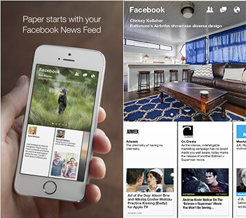
Paper looks and feels completely different from Facebook’s design. Its magazine-style layout is full of distraction-free, full-screen alluring design. Paper’s logo and typography throughout the app feature Helvetica Neue’s Ultra Light. The thin look and light feel of Paper makes the Facebook app interface seem outdated.
A photocentric editorial approach within news makes the experience even faster, and even easier to share photos. With Paper, you can:
- Zoom into vivid high-resolution photos to see details up close
- Tilt the screen to explore photos from a new perspective
- Watch full-screen videos that come to life and fill the screen

Ideal User Experiences (UX)
Organized, easy-to-scroll horizontal cards, and tap-worthy featured photos from recent stories make for an editorial-driven home screen. Users want to browse quickly, respond to a thread or check on events. Intuitive gestures and micro-interactions make Paper’s user experience clean, simple and seamless. Everything that can be done in Facebook and on the Facebook app can be accomplished in Paper, but in a much cleaner fashion. One huge benefit is that, unlike the Facebook app, there are no additional apps needed for communication with other users (ex: Messenger); it’s all included under the message icon.
Recent updates come with performance enhancements designed to make various features within the app run faster, including photo uploads. Paper’s features include:
- Easy Navigation. Sections offer more topics and each has a personal hidden menu
- Faster performance. This is especially true when sharing photos:
- Posting a photo is quicker in Paper because Facebook may be running multiple apps in the background and could soak up your phone’s battery life.
- You can share photos right from your “favorites” album with iOS 8
- Access to photos and videos is organized by recent date in the Camera Roll
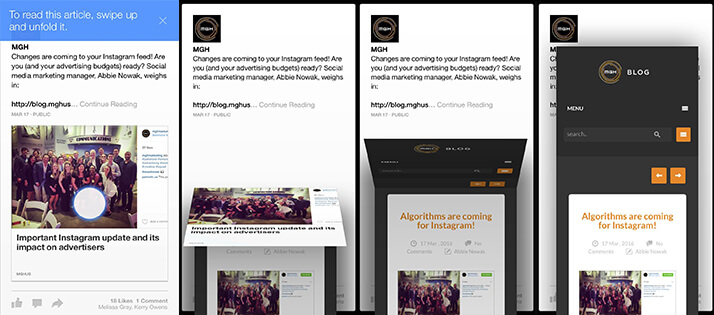
- Gestures. Unfold beautiful article covers for news and stories from trusted sources:

Socially tested, designer-approved.
Paper has changed the way I view and interact with Facebook. See if you’d like to change the way you experience your news feed. Facebook’s Paper App can be downloaded from the App Store for free.


