Retailers Beware! Make Sure Your Website is Mobile Ready!
It’s that time of year again…retailers are hitting consumers hard with every kind of marketing medium available. My mailbox is full of catalogs, my inbox is full of promotional emails, and Paw Patrol, which my two year old is obsessed with, has about ten minutes of commercials with every “must have” children’s toy for this season. None of this is surprising with Black Friday on the horizon and Christmas and Hanukah a little over a month away. But what is surprising is the number of these retailers—large retailers—that are advertising, but don’t have mobile friendly websites!
In a study by GfK, commissioned by Facebook IQ, 45 percent of people are either purchasing using their mobile devices or doing researching and comparing prices on their mobile devices. So, it’s extremely important for retailers to make sure they are providing their customers with the best user experience possible when they are shopping this holiday season.
It’s probably too late now, but for what it’s worth, retailers please make sure you either have a responsive site or a mobile version of your site. There is nothing worse then having to zoom in to click menu items, having to scroll left and right to see the full page, and trying to navigate a non-mobile friendly form to check out.
Below are a couple of examples of department stores that are doing it right and others that need an update…quick!
Macy’s does a great job of first making sure their customers understand how to navigate their mobile site by briefly explaining the hamburger menu.

JCPenney does a nice job with their mobile site, keeping it simple with the most important elements at the top of the page. They also have an app available, which they promote at the top of the page for visitors who are coming to the site for the first time.

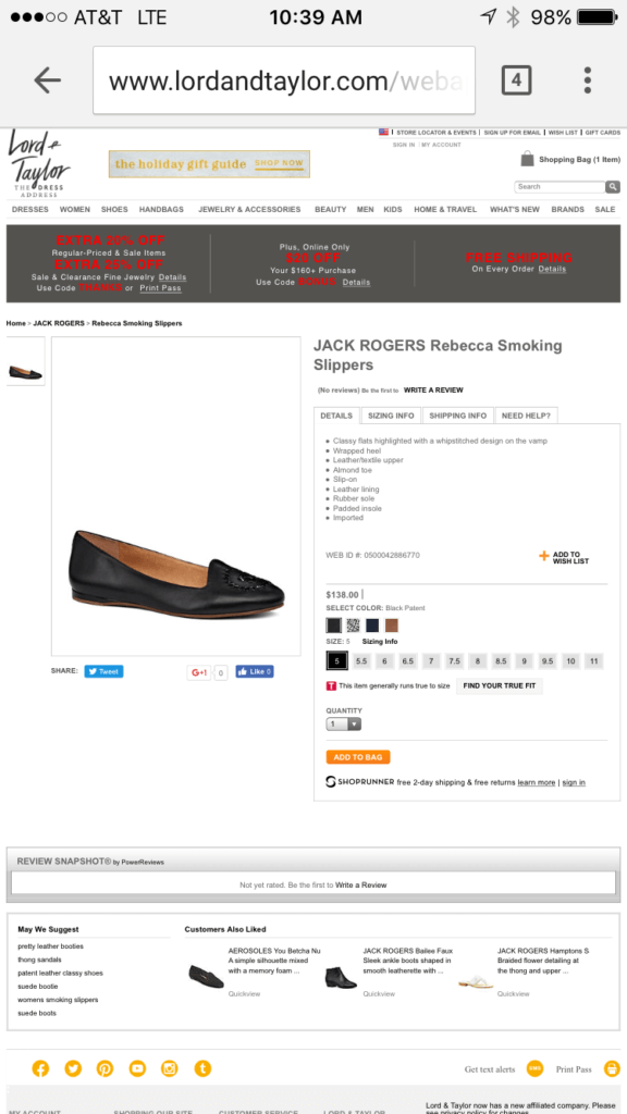
Lord and Taylor hasn’t done anything to make the mobile experience better for their customers. You have to zom, scroll left and right, and will probably get frustrated and leave the site.

Dillard’s has a nice clean mobile site, but it leaves a lot to the imagination as it might be overly simple.


