Vertical Video is King, and Facebook Knows It

If you were to rewind a year or two and ask marketers what they thought of vertical video, chances are that you’d get a few scoffs and rolled eyes from the hardcore believers that video is meant to be enjoyed horizontally. After all, video has been presented in a horizontal format since the beginning of time -- or, at least, the beginning of video.
But all that has changed, and it’s changed rapidly. The status quo has been challenged, and even the non-believers can’t deny that consumer habits are shifting to make mobile the norm, and with that comes a shift to vertical video.
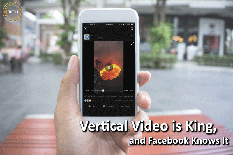
The world’s largest social network thinks so, too. The rise of vertical video is illustrated by a recent and major update from Facebook: video clips will now automatically appear as vertical in users’ News Feeds, as opposed to the current 1:1 square format.
According to Facebook, the reason for the change is to allow for a “more immersive and engaging experience for users, which will benefit publishers and advertisers.” In other words, it’s a win-win, at least in the eyes of Facebook.
A Few Basics
Here’s what you need to know about the update:

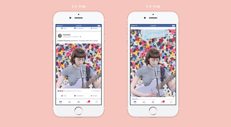
- The ratio of vertical videos in Facebook’s mobile News Feed will now extend up to 2:3 -- and that includes organic videos and videos in ads. Previously, vertical video was cropped to a 1:1 ratio and users would have to expand to watch the video in its full vertical format.
- The update will be gradually rolled out until the first week of September, when it will be available globally.
- Videos in Instagram ads will not be affected, and neither will videos in carousel ads.
- According to an email from a Facebook representative, all vertical video content will now become “first class citizens in News Feed.”
And now that you know the basics, you’re probably wondering why you should care. After all, a switch from a 1:1 format to a 2:3 format doesn’t seem all that significant -- but it is for several reasons.
Why Does It Matter?
Facebook’s update is an important one for three main reasons. One, it illustrates a major shift in video consumption habits. Two, it goes to show that desktop is quickly becoming an afterthought for social platforms and brands. And, last but not least, the shift can be viewed as another example of Snapchat leading the way in social trends.
#1: Vertical Videos = More Engagement
Vertical video doesn’t just look prettier on mobile. During testing, Facebook found that users are more likely to spend more time watching vertical videos than videos in the current format, according to an article from Marketing Land.
How much longer? That remains to be seen, but according to AdWeek, advertisers on Snapchat have reported nine times more engagement on that platform when their video ads are vertically oriented.
Which means that once the Facebook update is rolled out in full, if your brand’s videos aren’t oriented vertically, you risk the chance of being skipped over by users.
#2: Later, Desktop
The switch from a square layout to a vertical one only further emphasizes the fact that desktop is becoming less and less relevant. The new format looks awkward and too skinny on desktop (see below), but that’s not much of a concern for a platform that has approximately 1.03 billion daily active users on mobile, as reported in June 2016 (which is a 22% year-over-year increase).
It’s just another example of why brands should be designing for mobile, with desktop as an afterthought.

#3: Snapchat is a Serious TrendsetterThe update emphasizes the fact, loud and clear, that Snapchat continues to set social trends, and other platforms are scrambling to catch up (we’re looking at you, Instagram Stories). And what works for Snapchat works for the ever-elusive Gen X and Millennial generations. A whopping 63% of Snapchat users -- which is estimated at over 200 million, according to an AdWeek article -- are between the ages of 13 and 24.
Brands that are trying to reach a younger audience should be particularly excited for the opportunity to reach these users in a format that feels more natural to them.

An Observation
If you ask me, I think the update speaks to another important fact: users are getting seriously lazy. And by lazy, I mean that they increasingly expect their mobile experience to be flawless, and they’re not likely to take the extra step. For example, rotating their phones to view a video or clicking a square-shaped video to expand -- because they expect more from their mobile experience.
How hard is it to actually use your wrist muscles to rotate your $700 smartphone 90 degrees? It’s not, but that’s beside the point. When users have the option of making zero effort, that’s what they’re going to choose. Every time.
Over the next few weeks, keep your eye out on your Facebook News Feed to see which brands are quick to adapt to the new vertical format, and which refuse to make the switch from traditional horizontal. It’s your move, marketers!


